
A community to be your own type of African Mommy
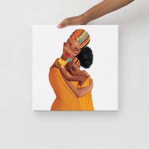
African Mommy is a community for moms and women of African origin. The platform aims to provide a support network.
View More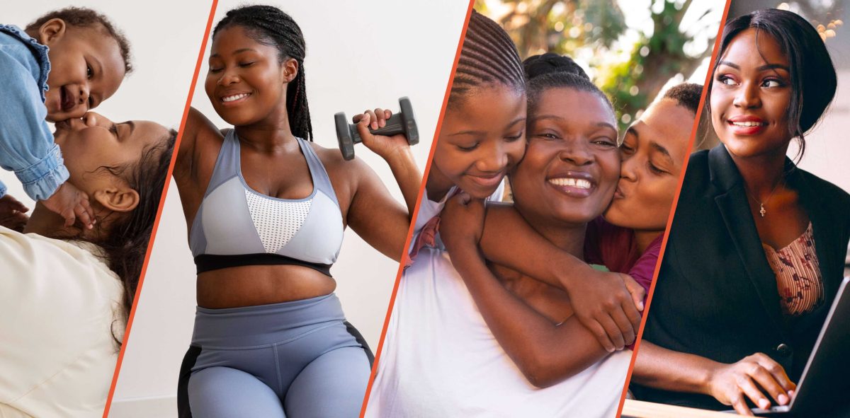
African Mommy is a community for moms and women of African origin. The platform aims to provide a support network.
View More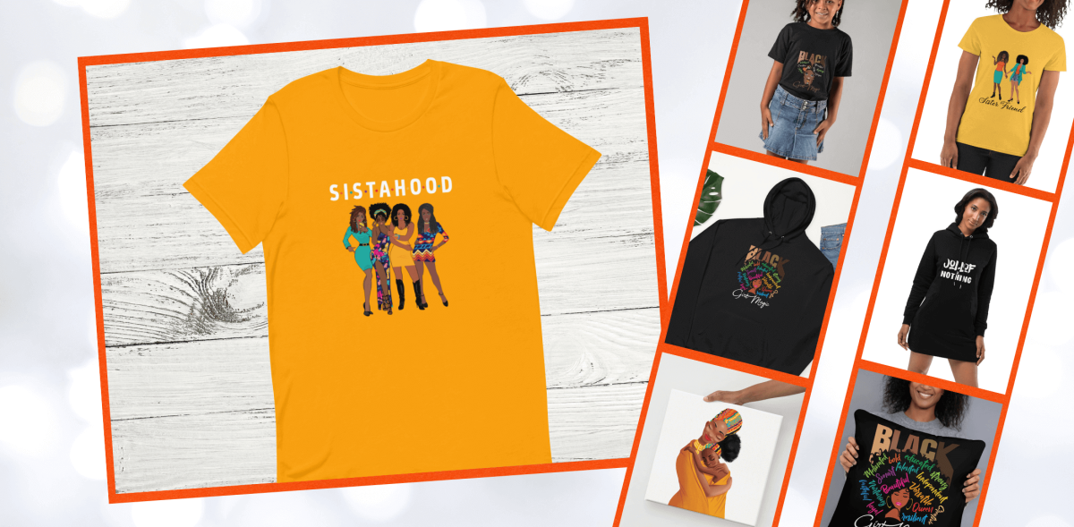
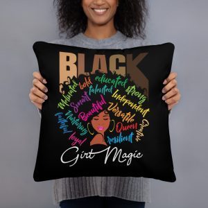
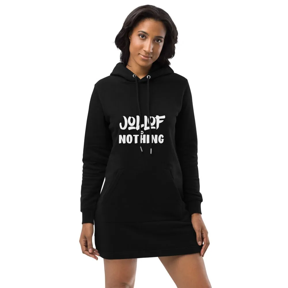
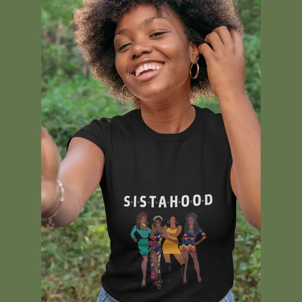
Don’t let winter catch you unprepared. Get a ‘Sistahood’ hoodie today and enjoy the warmth and chicness you’ll get from its soft fabric, hood, and convenient pouch pockets.
View More
The platform aims to provide a support network that empowers and celebrates mothers and women for who they are and encourages them to be the best version of themselves.

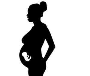
We know how important expert information is to expectant parents at every stage of pregnancy and we are excited invite you to join the Mediclinic Baby programme
View More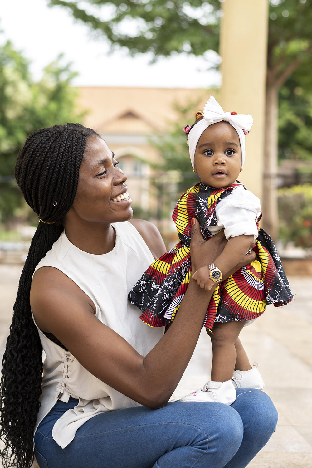
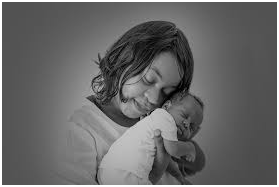
Motherhood typically refers to the role and experience of being a mother, which involves caring for and raising children. It's a significant and complex life journey that involves various responsibilities, emotions, challenges, and joys
View More
Lifestyle refers to the way a person or group of people live their lives, including their daily routines, behaviors, habits, and choices. It encompasses various aspects of an individual's life, such as their behaviors, attitudes, preferences, activities, and social interactions. A person's lifestyle is influenced by a combination of factors, including personal values, cultural background, socioeconomic status, environment, and personal choices
View More
Please select the first day of your last period
You last period date:


